Novo Nordisk - Channel identity design
Visual Identity, Motion Graphics
From the creative brief: Novo Nordisk wants to modernize their visual communication by introducing a mini channel design that can be used across their internal and external media platforms. The design should build upon Novo Nordisk's current corporate visual identity (CVI) and values, while presenting a modern and professional expression that strengthens the brand's profile.
Research phase & Styleguide
Starting off I reached out to my friend who works at Novo Nordisk, and discussed possible way to split the Novo Nordisk brand into 3 categories/areas.
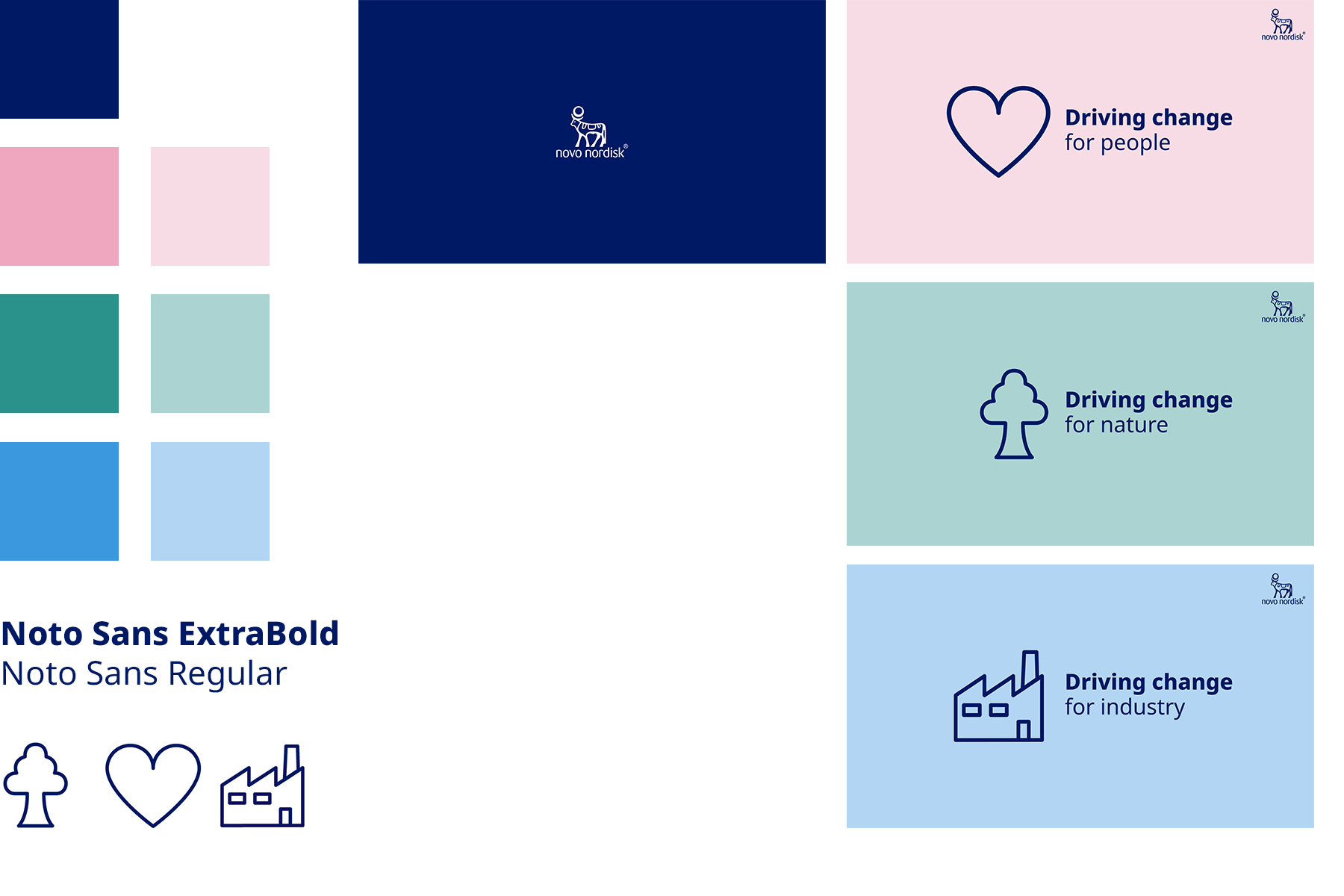
We came up with the 3 possibilities: Nature, People & Industry.
I found 3 colors from the CVI that could communicate those categories and likewise found 3 symbols in their symbol catalogue that corresponded to the same.
We came up with the 3 possibilities: Nature, People & Industry.
I found 3 colors from the CVI that could communicate those categories and likewise found 3 symbols in their symbol catalogue that corresponded to the same.
The communication became "Driving Change for" nature, people & industry.
Motion Graphics work begins
Next up I would like to communicate when one area is the active one and started going the motion graphic work. So all 3 areas got their own mini-CVI and I did also add title design to showcase interview/expert scenes.
For this, I created the Wipe-element.

This is the final design